
Accurate Image Manipulation for Desktop Publishing Photoshop
by Timo Autiokari
...
AIM: Photoshop v 6.0, Blend Using Gamma 1.0
........
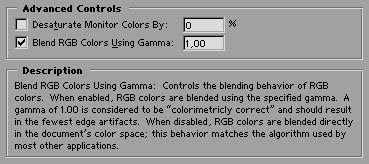
The Coverage of the Blend RGB Colors Using Gamma -optionThe Blend RGB Colors Using Gamma option is a new feature in Photoshop 6.0 (in Advanced Color-Management, go to Edit/ColorSettings... and select the Advanced check-box). The description that Photoshop shows for this option is:
The Coverage of the Blend RGB Colors Using Gamma -optionThe Blend RGB Colors Using Gamma option is a new feature in Photoshop 6.0 (in Advanced Color-Management, go to Edit/ColorSettings... and select the Advanced check-box). The description that Photoshop shows for this option is:
...
....
The description is not fully correct since this option also enables correct colors all over the image, not just the fewest artifacts at the edges.
The description is not fully correct since this option also enables correct colors all over the image, not just the fewest artifacts at the edges.
...
This page demonstrates the effect of the Blend RGB Colors Using Gamma 1.0 option and compares the result with a GaussianBlur filter that also blends RGB colors but is not covered by the option, that is the case at least for all the filter operations but possibly for many other editing operations too.
This page demonstrates the effect of the Blend RGB Colors Using Gamma 1.0 option and compares the result with a GaussianBlur filter that also blends RGB colors but is not covered by the option, that is the case at least for all the filter operations but possibly for many other editing operations too.
...
Please download the examples (6kB zip archive) in case you want to duplicate the results on your own computer.
Please download the examples (6kB zip archive) in case you want to duplicate the results on your own computer.
....
Layer Blending in Normal mode using Opacity 50%
Layer Blending in Normal mode using Opacity 50%
....
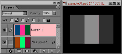
Blend RGB Colors Using Gamma 1.0 option set OFF
...
...
...
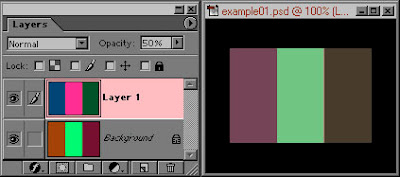
Blend RGB Colors Using Gamma 1.0 option set ON
....
....
....
....
To reproduce the above on your computer:
.....
2 Set your working-space to Adobe RGB (1998) in Edit/ColorSettings.
2 Set your working-space to Adobe RGB (1998) in Edit/ColorSettings.
.....
3 Open the example01.psd.
3 Open the example01.psd.
.....
4 Go again to Edit/ColorSettings and select the Advanced check box, the dialog will expand a little. Drag the dialog so that you can see the example01.psd.
....
5 Verify that the Preview check-box is selected.
5 Verify that the Preview check-box is selected.
....
6 Now toggle the Blend RGB Colors Using Gamma 1.0 option ON and OFF.
6 Now toggle the Blend RGB Colors Using Gamma 1.0 option ON and OFF.
....
Amazingly the colorimetricly incorrect blending (with the Blend RGB Colors Using Gamma 1.0 option set to OFF) blends the colors from the two layers to rather dark gray values. The correct blending (with the Blend RGB Colors Using Gamma 1.0 option set to ON) produces rather saturated hues.
.....
The colors for this example are naturally well chosen, they show how very large the hue error can be. This behavior, blending incorrectly to gray is not at all the only type of error that is induced by blending the colors in a non-linear working-space, all colors will blend incorrectly producing varying amount of hue errors.
The colors for this example are naturally well chosen, they show how very large the hue error can be. This behavior, blending incorrectly to gray is not at all the only type of error that is induced by blending the colors in a non-linear working-space, all colors will blend incorrectly producing varying amount of hue errors.
.....
Gaussian Blur example
Gaussian Blur example
.....
The Gaussian Blur filter is an averaging function, in regards to the issue of blending the RGB colors the only difference to the above 50% layer blending is that the source data for the Gaussian Blur averaging is taken spatially from the single layer that the Gaussian Blur is applied.
The Gaussian Blur filter is an averaging function, in regards to the issue of blending the RGB colors the only difference to the above 50% layer blending is that the source data for the Gaussian Blur averaging is taken spatially from the single layer that the Gaussian Blur is applied.
.....
The below example shows the result of GaussianBlur when applied over the color pattern (shown by the background -layer) in in the non-linear AdobeGamma color-space and in the linear AIM RGB color-space. The colors of the pattern are the same colors as the leftmost section in the layer blending example above.
The below example shows the result of GaussianBlur when applied over the color pattern (shown by the background -layer) in in the non-linear AdobeGamma color-space and in the linear AIM RGB color-space. The colors of the pattern are the same colors as the leftmost section in the layer blending example above.
..
...
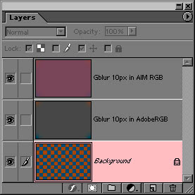 Gaussian Blur results in AdobeRGB and in AIM RGB
.......
.....
To reproduce the Gaussian Blur experiment on your computer:
....
2 Exit Photoshop.
2 Exit Photoshop.
....
3 Copy the linear AIM RGB.ICM profile from the archive to the c:\windows\system\color -folder.
3 Copy the linear AIM RGB.ICM profile from the archive to the c:\windows\system\color -folder.
....
4 Start Photoshop.
4 Start Photoshop.
....
5 Set your working-space to Adobe RGB (1998) in Edit/ColorSettings.
5 Set your working-space to Adobe RGB (1998) in Edit/ColorSettings.
....
6 Open the example02.psd.
6 Open the example02.psd.
....
7 Duplicate the background layer twice.
7 Duplicate the background layer twice.
....
8 Apply Gaussian Blur at 10px on the Background copy -layer. This is the result in the non-linear Adobe RGB (1998).
8 Apply Gaussian Blur at 10px on the Background copy -layer. This is the result in the non-linear Adobe RGB (1998).
....
9 Profile convert the image to AIM RGB (do Image / Mode / Convert-to-Profile... and select the AIM RGB -profile from the Destination Space dropdown.
9 Profile convert the image to AIM RGB (do Image / Mode / Convert-to-Profile... and select the AIM RGB -profile from the Destination Space dropdown.
....
10 Apply Gaussian Blur at 10px now on the Background copy 2 -layer. This is the result in the linear AIM RGB.
....
....
Now compare the results between the the Gaussian Blur operations and the above layer blending example (leftmost section).
....
GaussianBlur applied while the data was in the non-linear Adobe RGB working-space results the same* incorrect gray as the layer blending with the Blend RGB Colors Using Gamma 1.0 option set to OFF.
....
Applying the GaussianBlur while the data was in the linear AIM RGB working-space results the same* correct hue as the layer blending with the Blend RGB Colors Using Gamma 1.0 option set to ON.
...
* small difference is due to round-off errors
..
Conclusion: The Blend RGB Colors Using Gamma 1.0 -option does not cover all the editing operations correctly.
.....
......
Blending black and white
....
This example is a simple gray blending demonstrating the behaviour of the vision and how the working -space gamma affects to it.
....
The example document bw-blend.psd is in the non-linear AdobeRGB(1998) color-space.
....
The left section is on its own layer and is composed by alternating black (level 0) and white (level 255) lines.
The working-space gamma does not affect at all to the apperance of this dither since gamma does not affect to the end-points of the range. When this dither is viewed at a distance of about 1 meter (3 feets) the vision will blend it to 50% gray.
...
The right section of the bw-blend.psd is composed by two layers, lower layer being black (level 0) and on top of it a white (level 255) layer in normal more and 50% opacity.
...
So, both sections should appear to have the same luminance when the image editing (here layer blending) is correctly performed.
....
....
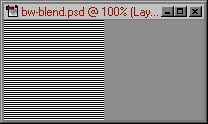
Blend RGB Colors Using Gamma 1.0 option set OFF
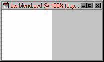
Blend RGB Colors Using Gamma 1.0 option set ON
..
..
To reproduce the black and white dithering example on your computer:
..
2 Set your working-space to Adobe RGB (1998) in Edit/ColorSettings.
2 Set your working-space to Adobe RGB (1998) in Edit/ColorSettings.
...
3 Open the bw-blend.psd.
3 Open the bw-blend.psd.
...
4 Go again to Edit/ColorSettings and select the Advanced check box, the dialog will expand a little. Drag the dialog so that you can see the bw-blend.psd.
4 Go again to Edit/ColorSettings and select the Advanced check box, the dialog will expand a little. Drag the dialog so that you can see the bw-blend.psd.
...
5 Verify that the Preview check-box is selected.
5 Verify that the Preview check-box is selected.
...
6 Now toggle the Blend RGB Colors Using Gamma 1.0 option ON and OFF.
6 Now toggle the Blend RGB Colors Using Gamma 1.0 option ON and OFF.
...
7 Conclusion: also gray blending is correct only when linear image data is manipulated.
7 Conclusion: also gray blending is correct only when linear image data is manipulated.
...
....
Link: by © Timo Autiokari, 2001-2007
Link: Download AIM Profiles by © Timo Autiokari
Link: by © RETOUCH Pro


